
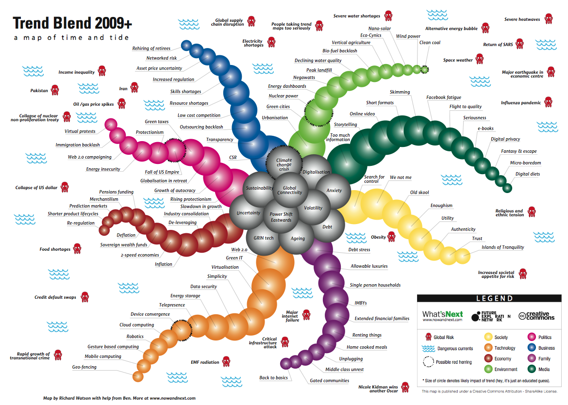
Here’s how it works. The main body of the map contains the mega-trends.
- Global connectivity
- Anxiety
- Volatility
- Uncertainty
- Debt
- Power shift Eastwards
- Ageing
- GRIN technologies
- Digitalisation
- Climate change
- Sustainability
There are then eight arms, which represent the following sectors or areas:
- Society
- Technology
- Economy
- Environment
- Politics
- Business
- Family
- Media
The circles on each arm are the sector trends and the size of he circle is related to the likely impact of the trend over the next twelve months or so.


1 comments:
i like the 2009 trend map! VERY WELL DONE!
Post a Comment