Tuesday, March 31, 2009

想上大学?先去Youtube瞧瞧吧

YouTubeEdulogo.jpg

Youtube昨天晚上刚刚推出了一个便民页面。这一便民页面聚合了美国100多所高等院校的所有视频。Youtube.com/edu为校园观光,免费讲座,研究动态以及其他学校信息提供一站式服务。搜索查询也可以限定在这一板块。

这是一个好主意,我们希望年轻人能体会和欣赏这一站点好处。它给我们的第一印象比iTunes University要好。它可以给年轻人在申请学校时提供更多的信息。另外站点上也为所有人可以学习的优秀内容。

在之前有限的体验中,我发现iTune上的学术内容非常有限,通常内容无聊,而且也很难买到。

在一年前,我问道"Youtube是下一个Google吗?”,其中提到在线搜索中最让人感兴趣的一个搜索类型是视频搜索。网上有很多视频内容,尤其是youtube上,内容无所包。大学方面的视频内容?想都不用想,肯定有

全球最大正版免费音乐下载库问世

谷歌中国和巨鲸音乐网30日宣布向中国用户正式推出免费正版音乐搜索 ,这是迄今为止全球唱片工业支持的最大的正版免费音乐下载库。

作为百度最具威胁的竞争对手,谷歌此次推出音乐搜索也意在打破百度在这一领域一家独大的垄断局面。有数据显示,百度MP3搜索占其总流量的近10%,而在全国音乐搜索市场份额则超过90%,远远超过QQ音乐搜索、搜狗音乐搜索等,一直位居垄断地位。 李开复表示,谷歌中国的音乐搜索是独一无二的,是谷歌全球各分公司中唯一推出这一功能的,这也标志着谷歌总部已经对谷歌大中华区放权,谷歌十分重视中国市场。

Google 黑板报用了这样的标题:用音乐的语言搜索音乐 谷歌音乐搜索带你回归人类音乐天性

我迫不及待地想试试看,尤其是那个flash做的“挑歌”和“相似歌曲”功能,听说这种新的音乐搜索模式,能根据音乐的节奏、音调甚至配器,去帮助网民搜索歌曲。 但是很遗憾,看到了这个“暂时没有对您所在的地区提供下载和试听服务"我想这一音乐搜索出于版权保护方面的考虑,仅仅允许中国用户使用,而对国外用户则采用了封IP的方式,看来只有下个月回国才能亲身体会了。

google free map3 download
Sunday, March 29, 2009

Are long URLs wasting bandwidth


URL太长会消耗一些不必要的(服务器)流量。
url长度会影响流量?iWang
这个古怪的说法来自o3 Magazine(一份以开源程序和免费软件为主题的电子杂志,05年12月开办)27日一篇文章。连接
作者通过对诸如Facebook 网站url和网页流量的对比观察发现:这些超长url 为Facebook 浪费了 75MBit/s 的流量。而最佳优化方案是,把url 长度控制在150个字符以内。
作者的理由是,当浏览器打开网址,获取请求Get-Request 时,url 也会消耗部分流量。虽然这些并不会太多(多是以byte为单位的),但对于大站来说仍旧是一个客观的数据。所以,如图(例子是techcruch和o3magazine对比),当你乱七八糟的url过于长,就会带来一些不必要的消耗。

Word clouds for Stuff users's comments

The new stuff.co.nz is live for nearly a month now, the first post on this Newsroom blog has become our most commented-on post in Stuff blogging history. Obviously users are feeling very passionately about Stuff.

For those of readers who like the new site, that is great news. For those who don't, I hope they'll give it some time. We spent a lot of time thinking about navigation, design and functionality and we think we've ended up with a site that is visually more appealing and easier to use.

We appreciate that many of you think the old site wasn't broken so why fix it. We got a lot of the same feedback when we switched from the first version of Stuff to a new look two years ago. There are 554 comments so far, 90% are negative, most users simply wanted the old layout back. I put users's 554 comments into Wordle generating this word clouds:
Wednesday, March 25, 2009

Minimize HTTP Requests by CSS Sprites


Problem:


The new launched Stuff.co.nz is facing a loading speed issue. Currently has around 190 HTTP requests on pages, 126 image http requests on homepage, 78 CSS background images.I've done some research on optimization, 80% of the end-user response time is spent on the front-end. Most of this time is tied up in downloading all the components in the page: images, stylesheets, scripts, Flash, etc. Reducing the number of components in turn reduces the number of HTTP requests required to render the page. This is the key to faster pages.


How to improve?


According to first rule of 14 Rules for Faster-Loading Web Sites, Minimize HTTP Requests
http://stevesouders.com/examples/rules.php
http://developer.yahoo.com/performance/rules.html#num_http


How to optimize?


CSS Sprites are the preferred method for reducing the number of image requests. Combine your background images into a single image and use the CSS background-image and background-position properties to display the desired image segment.
CSS Sprites Generator http://www.csssprites.com/


Example


Little icons on one image file Examples:
Google http://www.google.com/images/nav_logo3.png

Yahoo! http://l.yimg.com/a/i/ww/sp/trough_2.0_062308.gif

Delicious http://static.delicious.com/img/del_sprite_smallIcons.gif
Tuesday, March 24, 2009

Image Optimization With Smush It

As many people have complaint about loading speed of new stuff.co.nz, I am doing some research on website optimization. Reducing image size is one of common ways.  There are many good image editing tools that allow us to get the best visual result for a certain file size but "under the hood" a lot more optimization can be done.

Smushit.com is a service that goes beyond the limitations of Photoshop, Fireworks & Co. It uses image format specific non-lossy image optimization tools to squeeze the last bytes out of your images - without changing their look or visual quality. You'll get a report of how many bytes you can save by optimizing your images and all the changed images as a single zip for download.


Yahoo exceptional performance team have built a image optimisation tool. Its amazingly easy to run.
  1. Install the firefox plugin and press on the little face on the bottom of the browser.
  2. Smushit will open a new tab and run the optimisation  process on the fly.
  3. Download the optimised images in a zip file!
After run the tool on stuff.co.nz homepage, 69.34k can be saved.see screenshot below: 
smush it Image Optimization
Now there’s no excuse for having bloated images. Every web developer should have this plugin installed !

World Map of billionaires

According to Forbes there are 794 dollar billionaires in the world. French mapping site I-Spirit has produced a Google Map showing the location of each of them . It is possible to filter the 794 billionaires by age or country.

One of the most glaring facts this map reveals is the north/south divide in the world's wealth. Of the 794 billionaires only 40 of them seem to live south of the equator.

The I-Spirit map comes with an option to embed the map in your own website or blog.

Monday, March 23, 2009

关于IE8的一点感想

微软与近日发布了IE8正式版本了。就新浏览器的兼容性问题,有个大公司的公关人员说出了很多人的心声了。“微软IE8连自己的网站都兼容不了,这说明中间还是有很多问题的。”……

1、IE8网页显示不正常用“兼容性视图”搞定。

“IE8不仅采用了国际通用的网页开发标准——W3C标准,并且为了兼容基于其它网页标准开发的网站,IE8还专门提供了“兼容性视图”功能。” 你就忽悠吧,反正用IE8打开的页面乱了,责任全是人家网站不够标准。连自家的首页都需要使用IE7兼容模式显示,真搞不懂这是为什么……
2、量身定做的meta标签。
XML/HTML代码
  1. <meta http-equiv="X-UA-Compatible" content="IE=EmulateIE7"  />  

记住这个伟大的发明吧。微软专利产品。强大的功能就是让网页能够在ie8中以ie7兼容模式,而目前是上至微软官网,下至平民博客,想不麻烦,那都得加。因为微软前段时间发布的与IE8不兼容网站清单中,几乎涵盖了你每天打开的所有网站,国内的就2400个,当然像我们这些平民博客它是没有统计的,全是QQ、淘宝、腾讯、新浪等等等等了。 发布了IE8正式版,而又高喊着让大家全去加这个可笑的标签。那和用IE7有啥区别呢?

3、不兼容网站列表内置。

IE8安装时,就将上述与IE8不兼容的网站清单塞进了用户的机器,当你打开浏览器访问网页时,只要是不兼容列表中的网站,IE8会自动以兼容模式运行。所以说要想去掉那个搞笑的“兼容模式”按钮,要不就向微软妥协,加段Meta标签,要不就像百度、Google不加标签人家也自动把你拉进落后分子名单……呵呵。

4、微软总是在用一个错误掩盖另一个错误。 这句至理名言不是我说的,呵呵。说出来之后微软有人回应道:“兼容IE8比较简单,只要符合W3C标准即可,但目前国内大部分网站都是兼容的IE6的标准,所以导致在IE8/FF/Chrome下面都会变形。”

5、微软自夸IE8性能超过Firefox和Chrome。

马上就有人跳出来反驳了。原来不是最快的,而是最慢的……

6、放心地装IE8吧,该来的都来了。

人家都叫“正式版”了,咱挡是挡不住的,有些朋友怕装了IE8之后看不到IE7的显示效果的可以放心了,点一下“兼容模式”按钮是是IE7效果了,还可以打开IE8的开发者工具来调试查看IE7/IE8的差异。这东西虽然赶不上Firebug,但个人感觉还是比以前的IE Developer Toolbar要先进一些的。

做前端的朋友们,浏览器兼容问题又增加了一个测试指标了……
Friday, March 20, 2009

Google logo -- First day of spring


Like Google logo - first day of fall in the southern hemisphere, some countries from the northern hemisphere such as google.co.jp google.co.kr display a logo called first day of spring.

The only differences are color of "G" and "l".

Internet Explorer 8 Final Available Now

一年前,微软发布了IE 8 beta,一个半月前它发布了IE 8 RC1,现在微软正式宣布发布IE8最终版。微软新闻稿称IE8将在美国东部时间3月19日中午通过http://www.microsoft.com/ie8发布25种语言版本,实际上你现在就能下载到正式版(虽然网页上显示的是RC1)。IE8的特性包括隐私浏览模式、更先进的地址栏和搜索栏,更好的标签处理。微软强调IE8是现有浏览器中最安全的:NSS Labs的研究显示IE8阻挡的恶意网站数量是其它任何竞争对手的2到4倍。

其它特性有:加速器——更快更容易的执行常用在线任务,通过一种混搭(mashup)模式直接将ESPN.com、Live Search和新浪的网页传递到你当前的浏览器页面;
Web Slices——即时提供你最常访问的网站如Digg、reddit、Yahoo! Mail的更新信息;
可视化搜索建议——搜索框提供丰富、实时的搜索提示。
但IE 8的一个明显缺陷是没有扩展支持,也就是不存在类似Fifefox的扩展生态系统。所以如果你喜欢定制浏览器,Fifefox仍将是你的最爱,但其它方面IE8目前拥有不小的优势,现在要看Fifefox 3.5如何予以回应了。

当今的浏览器界,Firefox 3、Safari 4、Opera 10和chrome 2都是各浏览器的全新之作,一家独大的微软必然成为这些新兴浏览器共同的“敌人”。

Google logo -- First day of fall


Google New Zealand and Google Australia released this logo to reminder people today is First day of fall. The logo contains a apple, orange, strawberry and falling leaf, which tells people harvest season is arriving.

The Southern Hemisphere starts turning colder and colder.... Back to my hometown China, today is start of Spring. Chinese seasons are traditionally based on 24 periods known as solar terms , and begin at the midpoint of solstices and equinoxes.
Thursday, March 19, 2009

Street View Netherlands is live

Google Maps launched street view of Netherlands and UK at the same day. One and half month before I arrive there. Hello Netherlands! I am coming soon .....

Royal Palace, Dam Square, Amsterdam


Rijksmuseum, Amsterdam


Centraal Station, Amsterdam

Street View UK is live

After 3 months waiting since launch of New Zealand street view, Google Maps finally  have released Street View in the UK and the Netherlands.

A number of major cities in the UK seem to have Street View.

The Houses of Parliament


Tower Bridge

View Larger Map

The Royal Albert Hall

View Larger Map

St Paul's Cathedral

View Larger Map

Trafalgar Square

View Larger Map

Piccadilly Circus


King's College, Cambridge
Tuesday, March 17, 2009

Stuff.co.nz logo -- Saint Patrick's Day

stuff.co.nz Saint Patrick's Day logo
In New Zealand Saint Patrick's Day is widely celebrated. It is tradition for people to wear green items of clothing, and the streets are often filled with revellers drinking and making merry from early afternoon until late at night.

This is the first doodle logo of Stuff.co.nz since we launched the new design. We will release doodle logos on specital days, keep your eyes on it!  

I love the logo! Go green today!

Google logo -- Saint Patrick's Day

Google Saint Patrick's Day logo 2009

Saint Patrick's Day,是纪念爱尔兰的守护神,圣博德主教(约385–461年)的节日,在每年3月17日举行。
这一天是爱尔兰人的国庆节,同时也是北爱尔兰的银行休假日与爱尔兰共和国、蒙特塞拉特和加拿大纽芬兰与拉布拉多省的法定节假日。在加拿大其他地区、英国、澳大利亚、美国和新西兰,圣帕特里克节虽然广为庆祝,但不是法定节假日。


Monday, March 16, 2009

How to create popup windows

The HTML and Javacript below will show you how to create popup windows in a simplest way.

First, copy this script into the section of your page:

<SCRIPT TYPE="text/javascript">
<!--
function popup(mylink, windowname)
{
if (! window.focus)return true;
var href;
if (typeof(mylink) == 'string')
href=mylink;
else
href=mylink.href;
window.open(href, windowname, 'width=400,height=200,scrollbars=yes');
return false;
}
//-->
</SCRIPT>

Secondly, insert HTML code:

<a href="popupbasic.html" onClick="return popup(this, 'notes')">my popup</a>

You done!
Sunday, March 15, 2009

百度315消费者权益保护日


这就是百度的315消费者权益保护日logo,真是个难看!百度因该换Graphic designer了。
Friday, March 13, 2009

Footprints of Stuff.co.nz

Stuff.co.nz has released new design for a while. Here, I would like to recall the changes in its history.

The website first launched in June 2000, and then re-launched with its second design in Dec 2006, and then relauched its third generation design in March 2009. Stuff has come a long way since that date, here’s a look at some the changes that have happened over the last 9 years. I was glad that I had involved in design and development of stuff3.

Stuff v1 June 2000Stuff v2 Dec 2006Stuff v3 March 2009

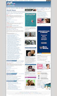
old stuff.co.nz homepage

Thursday, March 12, 2009

Happy 10th birthday to Trademe

trademe birthday logoTrademe.co.nz, the most popular New Zealand made website  turns 10 years old today. New Zealand entrepreneur Sam Morgan founded the site in 1999, and after some years of overall dramatic growth sold it to Fairfax Media in 2006 for NZ$750 million.

TradeMe is the second most visited in New Zealand after Google.co.nz, and is ranked 1095th globally according to Alexa


Site Statistics from Trademe

People online (average)70,000
No. of active members (live)2,205,428
No. of current listings (live)1,235,157
Average time spent on the site*16 minutes
Number of people who visit each month**4,682,800
Average number of people who visit each day**488,000
Busiest day of the week*Monday
Busiest hour of the day*9-10PM


eBay tried to enter the New Zealand market in 2001, but had little success. TradeMe has remained the major Internet-auction site in New Zealand, with both international and smaller national competitors gaining relatively little market penetration.

The results are obvious - today Trade Me has 1.19m listings in NZ and eBay Australia has just 1.16m items located in Australia. That’s right - there are more items for sale in NZ than Australia, and that’s a country with well over five times NZ’s population.

Happy birthday to Trademe, wish you continue to succeed!
Wednesday, March 11, 2009

IE family does not support display: none on span in ul li

I just discover that IE 6 & 7 are not following the display: none; rule in the span inside the li. I wonder where else has the same problem.

Here is the code example:

<html>
<head>
<meta http-equiv="Content-Type" content="text/html; charset=UTF-8">
<title> new document </title>
<style type="text/css">
* {
margin: 0;
padding: 0;
}

ul {
list-style: none;
width: 100px;
background: blue;
}

ul li {
width: 100px;
height: 20px;
background: green;
border: 1px solid red;
Vertical-align: top
}

ul li span {
display: none;
}
</style>
</head>

<body>
<div id="pagewrap">
<ul><li><span>one</span></li>
<li><span>two</span></li>
<li><span>three</span></li>
<li><span>four</span></li>
<li><span>five</span></li>
</ul>
</div>
</body>
</html>

So as you can see in IE it adds a gap between the li tags even thought its told to ignore the span and its content. I have found ways to make it work all listed below

1. Set ul li to float: left; <-- but maybe you dont want the ul li to be floated so that doesnt work -->

2. Set the ul li span to display: inline;margin:-500px; <--- but then you have to add overflow: hidden for ie6 to be truelly happy, and just doesnt seem right

3. Similar to 2 with the same issues but using text-indent: -5000px; on the ul li a tag again just doesnt seem right.

4. This seems to be the best solution that I have found and going to look into why a little more is to set the ul li to Vertical-align: top; or Vertical-align: bottom;
Tuesday, March 10, 2009

If browsers were women

Saw this at www.sharenator.org interesting, I like it.
If browsers were women

有道阅读器分析国人12个有趣的在线阅读特点

觉得这个有道阅读器的PPT挺有趣的,对于分析国内普通RSS在线阅读用户有很大的帮助。有道阅读器是网易旗下搜索引擎有道的产品,拥有导入MSN和网易的好友博客列表、右键菜单等特色功能。

这是一份基于百万用户的行为统计分析,但并非用户主动参与回答的调研报告,所有内容都基于实际线上数据的统计提炼,通过数字的统计得出,“看数说话”,仅供参考。

Sunday, March 8, 2009

Google logo -- International Women's Day

3月8日是国际劳动妇女节,又称三八节、妇女节、三八国际妇女节,是世界各国妇女争取和平、平等、发展的节日。一个世纪以来,各国妇女为争取自身的权利做出了不懈的努力。

1909年3月8日,美国伊利诺斯州芝加哥市的女工和全国纺织、服装业的工人举行规模巨大的罢工和示威游行,要求增加工资、实行8小时工作制和获得选举权。这是历史上劳动妇女第一次有组织的群众斗争,充分显示了劳动妇女的力量。斗争得到全国乃至世界其他国家妇女群众的广泛同情和热烈响应,最后取得了胜利。

第一次世界大战前,战争的阴影笼罩着世界,帝国主义企图瓜分殖民地。1910年8月,在丹麦首都哥本哈根召开了国际社会主义者第二次妇女代表大会。出席会议的有17个国家的代表,会议讨论的主要问题是反对帝国主义扩军备战,保卫世界和平;同时还讨论了保护妇女儿童的权利,争取8小时工作制和妇女选举权问题。领导这次会议的著名德国社会主义革命家、杰出的共产主义战士克拉拉·蔡特金倡议,以每年的3月8日作为全世界妇女的斗争日,得到与会代表的一致拥护。从此以后,“三八”妇女节就成为世界妇女争取权利、争取解放的节日。

1911年的3月8日为第一个国际劳动妇女节。

2004年Google谷歌推出第一个三八妇女节庆祝Logo
Wednesday, March 4, 2009

Is browser war a good thing for users?


相信大家最近都比较关注Safari浏览器,苹果公司2月24日发布的这个beta 版Safari 4,不仅可以在 Mac 和 Windows PC上运行,而且还号称是世界上“最快”、最具创新意义的网页浏览器。
姑且不去争论孰优孰劣,“仁者见仁,智者见智”的事物很难有一个确切的评断。有一点是肯定的,苹果最新版Safari代表着浏览器发展的方向——更快,更稳定,更易用,更加标准。即便是在速度和标准规格方面有所欠缺的微软IE,它也在朝着这样的方向坚定不移的前行。
但是,新的浏览器混战对最终用户意味着什么呢?

表面上看,你可能认为这是个愚蠢的问题:“这还用问?当然对我们用户有利了。”的确,激烈的竞争将有助于浏览器的发展,最终用户使用的浏览器也将因此而更快,更稳定,更安全,更容易使用。甚至居于统治地位的微软IE,近些年在这些方面也有很多改进(但仍有很长的路要走)。
但事实却并不一定是这样。作为一个网站开发工程师, 我同时在自己的电脑上安装几个浏览器,并按工作的不同转换使用这些浏览器。但这需要你给所有爆出的浏览器安全漏洞及时地打补丁,而且在不同的浏览器间转换使用会非常麻烦,例如,你不得不在不同浏览器间复制URL,有时你还需要更改浏览器的默认设置。

当然,你还得处理好每个浏览器的收藏夹——向新浏览器导入收藏夹是一回事,让所有的收藏夹保持同步则是另一回事(很难)。作为一个多浏览器用户,我深知这其中的麻烦。
个人而言,我比较喜欢谷歌Chrome和全新的Safari 4 beta(迄今为止,还是不怎么喜欢IE 8)。如果你也不喜欢微软IE,那么我推荐你还是使用Firefox,原因其实很简单——Firefox是最为成熟的IE替代品。

虽然谷歌Chrome的先占式多任务处理方式要优于Firefox,Safari 4的速度要快于Firefox,Opera的兼容性要强于Firefox,但不得不承认,Firefox在这些方面并不怎么逊色,而且Firefox还拥有丰富的应用插件。

尽管其他浏览器具备某些方面的优势,但如果你选择放弃使用IE,Firefox将是一个非常好的选择。毕竟,IE和Firefox还占据着绝大部分的浏览器市场份额。
那么,你认为最终用户会从新的浏览器混战中获益嘛?

New stuff.co.nz launched


The wait is finally over; new Stuff has arrived.

This upgrade will provide you with more opportunity than ever before to participate in the site’s community by contributing photos, videos, news tips and enhanced commenting. The new site will also provide better, richer and faster access to breaking news and commentary from around New Zealand and internationally.

A major feature of the new site is the ability for readers to customise their Stuff homepage.

Readers can choose any section or sub-section from Stuff or Fairfax's newspaper websites to appear on their homepage. They can also use Stuff’s news widget to create a customised news feed of stories on people or subjects that particularly interest them.The new site will give you a high degree of control over what content appears on your Stuff homepage - providing easy, personalised, access to news and information on everything from what’s going on in your local neighbourhood, through to coverage of your favourite sport or celebrity.

Take a look at some screenshots of old stuff.co.nz.

HomepageSection Landing PageStory Page

old stuff.co.nz homepage

old stuff.co.nz section page

old stuff.co.nz story page


Check it out the new one now and let me know what you think!!
Sunday, March 1, 2009

Loewe sound

Another genius ad.