Showing posts with label css. Show all posts
Friday, January 15, 2010

stuff.co.nz Logo by HTML+CSS

It's Friday afternoon, I am feeling bored, so spent half hour to built stuff.co.nz logo by pure html+css. It was heaps of fun. Here is the preview and my code, guess left one or right one? From you memory,  don't look at stuff.co.nz!


HTML

<div id="logo">
 <span id="text">stuff<span class="dot first">.</span><span class="domain">co</span><span class="dot">.</span><span class="domain">nz</span></span>
 <ul><li id="r"></li><li id="y"></li><li id="g"></li><li id="b"></li><li id="p"></li></ul>
 </div>

CSS

#logo{font-family:tahoma;font-weight:bold; width:235px;}
 #text{font-size:62px;}
 .dot{font-family:Georgia; font-size:36px; letter-spacing:-2px;}
 .first{margin-left:-7px;}
 .domain{font-size:32px; letter-spacing:-1px;}
 ul{margin: -6px 0 0; list-style:none; padding:0}
 li{float:left; width:45px; height:10px;}
 #r{background-color:#C7221F}
 #y{background-color:#F59900}
 #g{background-color:#007C47}
 #b{background-color:#007DCD}
 #p{background-color:#9C1A87}
Friday, January 8, 2010

Creating Triangles in CSS

Little people realize when a browser draws the borders, it draws them at angles. This technique takes advantage of that. One side of the border is colored for the color of the arrow, and the rest are transparent. Then you set the width of the border to something large, the ones above are 40px. To demonstrate here is a div with all sides colored.


HTML

<div class="css-arrow-multicolor">
</div>

CSS

.css-arrow-multicolor {
  border-color: red green blue orange;
  border-style:solid;
  border-width:40px;
  width:0;
  height:0;
}

Friday, November 6, 2009

YUI CSS Framework Tutorial

Css-framework-5 in 5 Popular CSS Frameworks + Tutorials & Tools for Getting StartedAccidentally,  I discovered iGoogle is using YUI CSS framework, being curiosity I've been digging around it, found that YUI CSS framework is very powerful, It's a very useful because has a lot of possibilities of grids and it also has a online grid generator to help fast start.

The CSS Frameworks are not for CSS starters (newbies)! They are for people who know CSS but want more organized approach.

Thursday, September 17, 2009

Use a CSS Reset Before Start

CSS resets: to use or not to use; that is the question. If I were to offer my own personal advice, I'd 100% recommend that you create your own reset file. Begin by downloading a popular one, like Eric Meyer's, and then slowly, as you learn more, begin to modify it into your own. If you don't do this, you won't truly understand why your list items are receiving that extra bit of padding when you didn't specify it anywhere in your CSS file. Save yourself the anger and reset everything! This one should get you started.


html, body, div, span,   
h1, h2, h3, h4, h5, h6, p, blockquote, pre,  
a, abbr, acronym, address, big, cite, code,  
img, ins, kbd, q, s, samp,  
small, strike, strong,   
dl, dt, dd, ol, ul, li,  
fieldset, form, label, legend,  
table, caption, tbody, tfoot, thead, tr, th, td {  
margin: 0;  
padding: 0;  
border: 0;  
outline: 0;  
font-size: 100%;  
vertical-align: baselinebaseline;  
background: transparent;  
}  
body {  
line-height: 1;  
}  
ol, ul {  
list-style: none;  
}  
blockquote, q {  
quotes: none;  
}  
blockquote:before, blockquote:after,  
q:before, q:after {  
content: '';  
content: none;  
}  

table {  
border-collapse: collapse;  
border-spacing: 0;  
}  
Thursday, August 20, 2009

CSS3 Box Shadows

CSS3 supports a new "box-shadow" property that makes light work of adding shadows to elements on your page, such as images, DIVs and SPANs.

The feature is supported in FF3.5, Safari 3.1+, and Google Chrome, albeit all via vendor specific versions of this property. And while IE (as of IE8) has not yet to jump on board.

Example:


<style type="text/css">
.shadow1{
box-shadow: 7px 7px 8px #818181;
-webkit-box-shadow: 7px 7px 8px #818181;
-moz-box-shadow: 7px 7px 8px #818181;
}
</style>

<div class="shadow1" style="width:500px; height:50px; padding:5px; background:navy; border: 1px solid black;"> </div>

For image example, please see my portfolio.
Monday, June 29, 2009

Max Width and Max Height for Images in IE

.mainimage {
max-width: 400px;
max-height: 400px;
}
This works great in Firefox, Safari, Opera, and Chrome. But it doesn't work in Microsoft IE6 or IE7 or IE8
I can't believe Microsoft STILL has not made their browsers standards-compliant for simple things like max-width and max-height.

Solution That Works For All Browsers
It turns out there's a way of doing the equivalent of max-width and max-height for IE browsers. If you use the following style, it will work on all browsers:
.mainimage {
max-width: 400px;
max-height: 400px;
width: expression(this.width > 400 ? "400px" : true);
height: expression(this.height > 400 ? "400px" : true);

}
Microsoft web browsers understand the Microsoft-only, non-standard "expression" element inside CSS. The part inside parentheses must be a Javascript expression yielding the string that should be used in place of the expression() portion. No other web browsers understand it, which is good for our situation - we can check and set the width and height elements of our image with it, just for Microsoft browsers.
Friday, April 3, 2009

25 Advanced CSS Tips


如果你对 CSS 的掌握已经到了一定的贯通程度,那么你手中的 CSS 将会为你做很多高级的功能,甚至有时候 CSS 可以帮助解决之前靠 JS 才能解决的问题, 要知道,在 Web 开发过程中, 减少一段 JS 可是对 Web 的运行有足够大的减压作用的。25个 CSS 高级教程,让你更了解 CSS。

1. 纯 CSS 字体渐变和背景渐变

css_gradient
CSS Gradients using pure CSS
Background gradients and CSS
gradient_text

2. Z-Index 图像重叠

z-index

3. CSS 边框创意

border

4. 超酷 CSS 效果 - 控制面板

osx

5. 纯 CSS 创建 2D/3D 按钮

css_button

6. Text Embossing/Shadow Technique With CSS

CSS_emboss
1. text-shadow: 0px 1px 0px #e5e5ee;

7. Iconize Text links/Hyperlink with CSS

icon_text

8. CSS Curly Quotes

qoutes

9. Using CSS Opacity for Various Cool Effects

css_opacity_menu

10. Blurry Background Effect

blurry_bg

11. CSS Parallax Effect

parallax

12.Create a Lightbox effect only with CSS

css_lightbox

13.CSS-Only Accordion Effect

css_accordian

14. Add grunge Effect to Text Using Simple CSS

grunge1

15.Create a Block Hover /Element Hover Effect

block_hover

16. Simple Dither Effect using CSS

dither

17. Create a liDock Menu

css_dock

18. CSS Hover Swap Effect

hover_swap

19. Polaroid effect using CSS

polaroid-css
Wednesday, March 25, 2009

Minimize HTTP Requests by CSS Sprites


Problem:


The new launched Stuff.co.nz is facing a loading speed issue. Currently has around 190 HTTP requests on pages, 126 image http requests on homepage, 78 CSS background images.I've done some research on optimization, 80% of the end-user response time is spent on the front-end. Most of this time is tied up in downloading all the components in the page: images, stylesheets, scripts, Flash, etc. Reducing the number of components in turn reduces the number of HTTP requests required to render the page. This is the key to faster pages.


How to improve?


According to first rule of 14 Rules for Faster-Loading Web Sites, Minimize HTTP Requests
http://stevesouders.com/examples/rules.php
http://developer.yahoo.com/performance/rules.html#num_http


How to optimize?


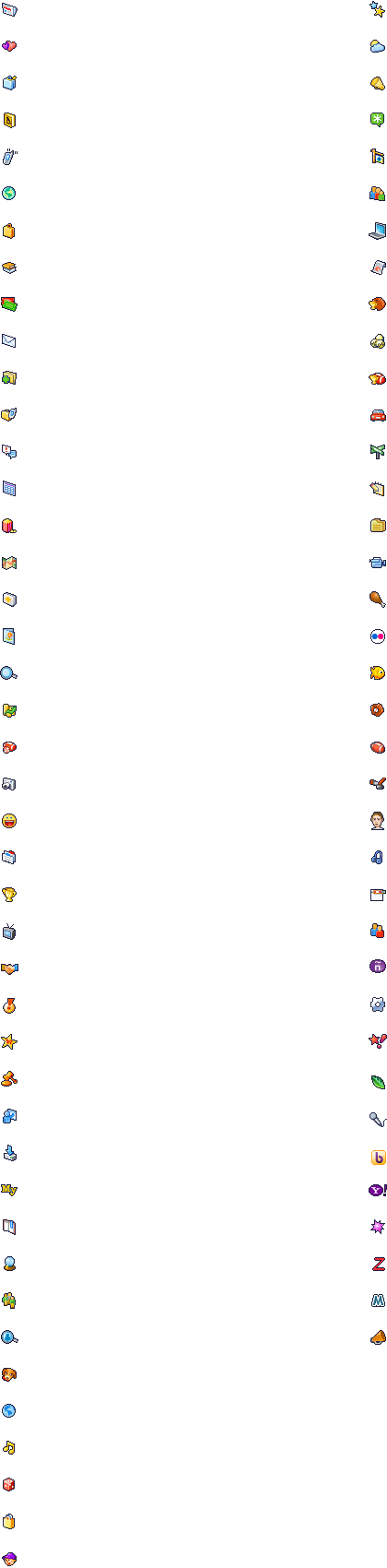
CSS Sprites are the preferred method for reducing the number of image requests. Combine your background images into a single image and use the CSS background-image and background-position properties to display the desired image segment.
CSS Sprites Generator http://www.csssprites.com/


Example


Little icons on one image file Examples:
Google http://www.google.com/images/nav_logo3.png

Yahoo! http://l.yimg.com/a/i/ww/sp/trough_2.0_062308.gif

Delicious http://static.delicious.com/img/del_sprite_smallIcons.gif
Wednesday, March 11, 2009

IE family does not support display: none on span in ul li

I just discover that IE 6 & 7 are not following the display: none; rule in the span inside the li. I wonder where else has the same problem.

Here is the code example:

<html>
<head>
<meta http-equiv="Content-Type" content="text/html; charset=UTF-8">
<title> new document </title>
<style type="text/css">
* {
margin: 0;
padding: 0;
}

ul {
list-style: none;
width: 100px;
background: blue;
}

ul li {
width: 100px;
height: 20px;
background: green;
border: 1px solid red;
Vertical-align: top
}

ul li span {
display: none;
}
</style>
</head>

<body>
<div id="pagewrap">
<ul><li><span>one</span></li>
<li><span>two</span></li>
<li><span>three</span></li>
<li><span>four</span></li>
<li><span>five</span></li>
</ul>
</div>
</body>
</html>

So as you can see in IE it adds a gap between the li tags even thought its told to ignore the span and its content. I have found ways to make it work all listed below

1. Set ul li to float: left; <-- but maybe you dont want the ul li to be floated so that doesnt work -->

2. Set the ul li span to display: inline;margin:-500px; <--- but then you have to add overflow: hidden for ie6 to be truelly happy, and just doesnt seem right

3. Similar to 2 with the same issues but using text-indent: -5000px; on the ul li a tag again just doesnt seem right.

4. This seems to be the best solution that I have found and going to look into why a little more is to set the ul li to Vertical-align: top; or Vertical-align: bottom;
Wednesday, February 25, 2009

Targeting IE Using Conditional Comments

条件注释是IE特有的一种功能,能对IE系列产品进行单独的XHTML代码处理,注意,主要是针对XHTML,而非CSS。

条件注释功能非常强大,可以进行true和false判断,例如:

Code:
<!--[if IE]>此内容只有IE可见<![endif]-->
<!--[if IE 6.0]>此内容只有IE6.0可见<![endif]-->


条件注释能被IE判断是什么版本的浏览器,并在符合条件的情况下显示其中的内容,从IE5.0到7.0都支持注释功能,而且版本号精确到小数点后4位:

Code:
<!--[if IE 6.1000]>此内容只有IE6.1可见<![endif]-->


IE条件注释还支持感叹号非操作:

Code:
<!--[if !IE 6.0]>此内容除了IE6.0版本之外都可见<![endif]-->


并且支持前缀,用于判断更高版本或是更低版本:

Code:
<!--[if gt IE 5.0]>此内容只有IE5.0以上版本可见<![endif]-->


这里的gt全称为greater than表示当前条件版本以上版本,但不包含当前版本。

还有其它几个前缀:

lt 表示less than 当前条件版本以下的版本,不包含当前版本。

gte 表示greeter than or equal 当前版本以上版本,并包含当前版本。

lte 表示less than or equal 当前版本以下版本,并包含当前版本。

Useful presentation for web developers

如果你正在寻找学习Ajax,PHP,CSS和JavaScript等网页制作方面的免费资源,这里收集了有关这些方面的六个线上演讲报告,你一定会感兴趣的。这个列表包括:简单的Ajax介绍,如何写标准的CSS代码,PHP对象设计模式基本原理,最流行JavaScript库的综览。


Monday, December 22, 2008

Transparent PNG in IE6 with CSS Hacks

IE6 is evil for web developers, we all know about PNG transparency and its problems with IE6.

Say your CSS code looks like this:
#logo { background: url(images/logo.png) no-repeat left top;}
Next, we would follow that with an IE-specific hack.
As it turns out, IE5.5 and IE6 think that it’s possible have an element above the HTML element. Fortunately, all other browsers on the planet know better, so they skip the next rule because it says: For all elements (*) with this selector path starting above the HTML element, do this.
And this is where we’d add our IE-specific alpha transparency filter.
* HTML #logo {/* PNG Alpha IE Win ONLY */ filter: progid:DXImageTransform.Microsoft.AlphaImageLoader (src='images/logo.png', sizingMethod='scale');}
What we’ve done here is display a transparent PNG natively in all browsers except for IE6, and displayed the same graphic via a proprietary alpha filter only in IE6.
Another way to fix the problem.